यह topic आपकी reading skill के साथ-साथ analytical thinking को भी improve करता है।
Interpreting Visual Information क्या होता है?
जब information को tables, graphs या charts के रूप में दिया जाता है और आपको उसे समझकर explain करना होता है, उसे Interpreting Visual Information कहते हैं।
आसान भाषा में:
Data को देखकर उसका meaning समझना = Interpretation
क्यों जरूरी है?
- data को जल्दी समझने में मदद करता है
- exam में direct questions आते हैं
- logical और analytical thinking improve होती है
- competitive exams में भी बहुत useful है
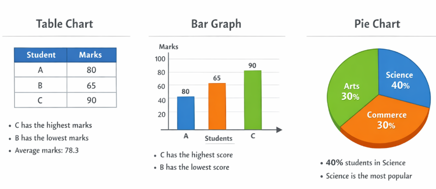
1. Tables (तालिका)
Table में data rows और columns में होता है।
Example:
| Student | Marks |
|---|---|
| A | 80 |
| B | 70 |
| C | 90 |
Interpretation:
- C ने सबसे ज्यादा marks लिए
- B के marks सबसे कम हैं
- Average निकाल सकते हैं
2. Graphs (ग्राफ)
Graph data को visual form में दिखाता है।
Types:
- Line Graph
- Bar Graph
Example (Bar Graph):
अगर graph में marks दिखाए गए हैं, तो आप बता सकते हैं:
- कौन highest है
- कौन lowest है
- difference कितना है
3. Charts (चार्ट)
Chart data को percentage या proportion में दिखाता है।
Example (Pie Chart):
- 40% students science में हैं
- 30% commerce में
- 30% arts में
Interpretation:
- science सबसे popular stream है
कैसे Interpretation करें?
- Title देखें
क्या data के बारे में है - Labels पढ़ें
rows, columns, axis को समझें - Data compare करें
कौन ज्यादा, कौन कम - Conclusion निकालें
overall result क्या है
Example Practice
अगर table में लिखा है:
| Year | Sales |
|---|---|
| 2022 | 100 |
| 2023 | 150 |
Interpretation:
- 2023 में sales बढ़ी है
- growth हुई है
Important Tips
- जल्दबाजी में answer न दें
- data को ध्यान से पढ़ें
- comparison करना सीखें
- key points note करें
Final Understanding
इस topic से आप सीखते हैं:
- data को समझना
- information को analyze करना
- सही conclusion निकालना
यह topic आपकी reading + thinking ability दोनों को मजबूत करता है।